Written by volunteer writer Marion Reidel
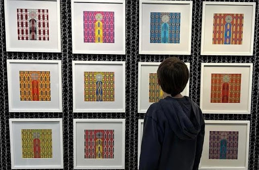
For this unique art exhibit, and sale, twelve local artists offer long-time favourites, or images that represent a previous body of work. Rather than insisting on new work, this show takes a look back which helps to clear out studios and provides an opportunity for affordable pricing. Stop by the artBar, above Miijidaa Café, Tuesday to Friday between 10:00 am and 4:00 pm to see this exhibit. Join the celebration on Thursday, April 4th from 5-7:00 pm for the closing reception.
Josie Ament has two works in this exhibition, both of which diverge from her body of work. “Richmond Rose” and “Zephyr” were inspired by cigar box graphics. They are rendered with bright colours of acrylic paint, but the pigment has been applied softly so the grain of the wood panel shows through. Accents have been added with gold leaf. They are an experiment in merging Josie’s love of nature, interest in typography and a passion for antiques.
Paige Bromby paints in oil on canvas. Her work is an ongoing dialogue with the natural world and how it relates to identity, personal history and collective memory. “Settle” is part of a body of work that examines the artist’s evolving relationship with the land her grandfather settled in the 1930’s. She unpacks personal and familial history with this landscape and the messy journey to understand the drastic changes it has undergone and the role she plays in stewardship and decolonization.
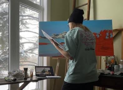
Stephanie Evans-Bitten paints in oil, both on canvas and boxed pine. She is a lover of urban animals and creates images for her own pleasure and self-expression. She describes her style as expressive realism. The subjects are immediately recognizable, but playful brushwork and high energy colours add a whimsical feel. For “Blue Heron at Guelph Lake” Stephanie has used vitrail medium to add a glassy, wet finish. Her painting “Lil’ Pug” captures the quizzical gaze of this adorable breed of dog.
Elizabeth Grin’s submission is acrylic on canvas. This is an early work that has a full artist’s statement attached to the back of the canvas. The title “Tempest” captures a feeling of turbulence. An irregular, vertical blue slash suggests an outburst and the energetic application of the paint offers a sense of agitation. And yet, Elizabeth’s colour palette is uplifting, using white and yellow to create a brightness that helps viewers respond to this instability as being positive in nature.
Addi Lemmon has two acrylic on canvas, abstract paintings in this exhibit. These two works were created as a response to the pandemic lockdown. “Lather” contains blue tones and curved organic shapes that represent the sterilization that became a focus during the virus. Addi was inspired by amoebic forms and the scent of sanitizer. During her walks in the forest, Addi envisioned “Pasture.” It is composed of straight geometric forms in earth tones that speak of humans’ connection to and organization of the land in which we reside.
Taras Lachowsky creates highly complex paper collages. His piece from the “Montanka Study Series” features a wheat stalk theme. Taras draws on the ethnography of Ukrainian patterns to create original designs. These pysanky patterns, best known for their use on Ukrainian Easter eggs, are also traditionally used on woodcarvings and ceramics. The intricate geometry of this work is impressive and the symbolism of the wheat stalk invites one to meditate on abundant harvests, both literally and as a metaphor for a balanced life.
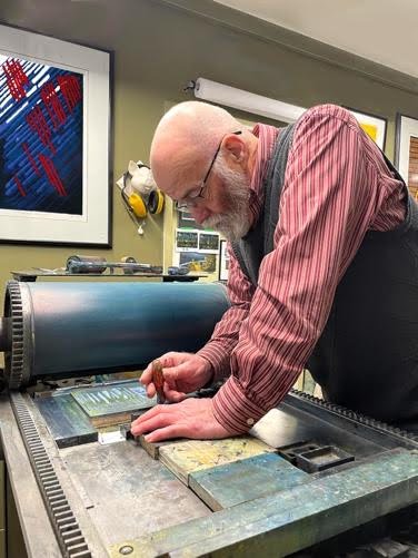
Clive Lewis specializes in printmaking, primarily engraving. He engraves an image into a hard surface, inks it and uses an 80-year-old proof press to pull a print. His work is usually reductive, which means he prints the lightest colour first, then removes more from the engraving and continues to print increasingly darker layers of colour. “Blue Day in Erin Township” features a classic bow bridge near Ostic. Clive captured this iconic rural architecture and surrounding landscape on a dismal winter day, so shades of blue to evoke the chill of that moment.
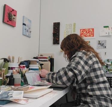
Dimitra Lupoi presents themes of empowerment through combining portraits of women with botanical imagery. Using graphite pencil, she captures the features and shading of the female face. Dimitra adds subtle earthy tones with watercolours, then accents the image with pen and ink. These works communicate that a connection with nature enhances one’s understanding of true beauty. “Bloom” depicts a woman radiating through perennials, with two suns illuminating her. While “Fields” shows a female’s face merged with flower outlines, emphasizing the power of oneness with nature.
Lisa Martini-Dunk has mastered the unique media of scratchboard art, using it much the same as traditional engraving. Once she has established the lines and textures, colour is added to make the image pop. “Susiadia,” titled from the Latin “Sus” for pig, and “arcadia” which means a place of pleasure. In this work a pig has Monarch butterfly wings. Lisa recalls that John Steinbeck’s teacher told him he’d be a writer when pigs fly. She’s captured this taunt to encourage viewers to pursue their own dreams. “Ultimate” is an award-winning work that features the seven categories of purebred dogs. These canines peer form the frame with curiosity that will capture your heart.
Jacob A. Mittermaier-Zubeck lets the medium guide the way. He works in the moment, paying particular attention to shadow and light. He enjoys the juxtaposition between the artist’s control and chance. His themes investigate the interplay between science and nature and include references to pagan beliefs. “Złoto młyn” means Goldie Mill, in Polish. Jacob created this surrealistic image, of the Guelph landmark, using ink with brush on paper. “Hubert’s Travel” is acrylic paint on wood, and has darker imagery, leaving much for the viewer to interpret.
Katherine Percival offers up two images inspired by drawing prompts. “Perspective” is an exploration of colour, pattern and imagery. This piece shows two ears rendered in dots of ink. One is unblemished, while the other has been embellished with colourful studs and rings. They face each other as a metaphor that questions our ability to understand others’ viewpoints. “Jellyfish” was rendered in a softer manner. Through this flowing blue shape, Katherine considered what flowers would look like if they were aquatic.
Lauren Wright Vartanian has two pieces from an earlier body of work in this exhibit. Both are multi-media abstracts that reference science specimens. The word phosphene, in each title, references the afterimage phenomenon that results from looking into light. “Marcesent Phosphene” means decaying leaves, and the warm colour palette with bronze overtones captures that clearly. “Polychromic Phosphene” refers to a rainbow spectrum. These are atmospheric dreamscapes that Lauren created by allowing the fluid acrylic paint to move and mix organically.